Jakob Nielsen's usability tests find the flat design trend threatens tablet usability due to unclear UI element functions

Jakob Nielsen's usability tests find the flat design trend threatens tablet usability due to unclear UI element functions

Vienna studio Perezramerstorfer helps Anne Lessmeister showcase her talent with these beautiful, handcrafted business cards.

We hand-pick some amazing examples of HTML5 in action, and talk to the designers behind them to find out how they were made.

The human mind is highly responsive to visual stimuli, and colour is one of the major defining factors in that response. On both a conscious and subconscious level, colours convey meaning - not only in the natural world but also within the artifice of our culture. Graphic designers need to harness the power of colour psychology to bring resonance to their designs - and in no field is this more important than that of logo design.

If you have an Apple ID, then you have an iCloud email account. This free account gives you up to 5GB storage for your emails, minus what you use for documents and other data you store in the cloud. It’s easy to work with your iCloud email from Apple’s Mail, on the Mac, or on an iOS device. Still, you may not know about the many extra options and features available if you log into iCloud on the Web.

Adding timecode to clips or projects is a great way to allow clients to review your projects and relate their comments to a specific time in the project. (This process is also called “timecode burn-in” – or “burning in timecode.”) This technique explains what you need to know.

The smooth shadow is the easier of the things we'll do. All we do is output a bunch of text-shadows of one color progressively fading them to black. Then, we need an animation which will change this color over time. A perfect job for hsl()!

Sometimes, particularly when you work with established brands and companies, you may encounter a set of brand or design guidelines. As a developer who might be working on a website without much design help, this can be something that you can really use to your advantage, guiding you in your design decision making.

Jamie Clarke of Type Worship explains how to get started in creating your own typography.
whatsmydns.net is an online service that allows you to instantly perform a DNS lookup to check a hostnames current IP Address and other DNS information against a selection of random name servers around the world. This is especially useful to check the current state of DNS propagation after making changes to your domains zones.

From simple charts to complex maps and infographics, Brian Suda's round-up of the best – and mostly free – tools has everything you need to bring your data to life
.jpg)
Handwriting fonts have been gaining more popularity over the past few months, so we decided to pick 20 of the best from across the web.

Graham Odds outlines principles that will help you to design more compelling data visualisations
For anyone without a color theory background, it will blow your mind.

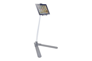
eight stands designed for the desktop or floor to see how they compare.

I look forward to Apple keynote presentations and product launches because, as a communication specialist, it’s hard for me to find a better role model for creating, designing, and delivering a presentation. The keynote at Apple’s Worldwide Developers Conference (WWDC) 2013 offers yet another opportunity to learn fresh and effective techniques that you can and should apply to your presentations.

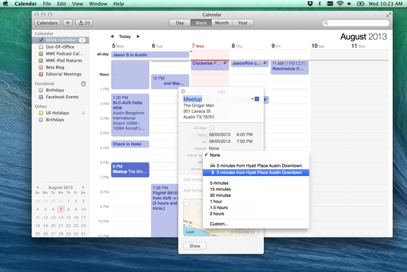
With WWDC way back in our rear-view mirrors and fall just around the corner, it’s time to wrap up my series of hands-on looks at the forthcoming OS X Mavericks release. I’ve already covered multiple-monitor support, Finder and tagging, Safari, and Notification Center. Here’s the best of the rest of what's new in OS X Mavericks. (Note: On some screenshots, you can click to enlarge.)
I like using diagrams as a way of showing information flow or browser behaviour, but large diagrams can be daunting at first glance. When I gave talks about the Application Cache and rendering performance I started with a blank screen and made the diagrams appear to draw themselves bit by bit as I described the process. Here's how it's done:

In this tutorial I'll show you how to import your photographs via XML, and get an average colour and brightness for each photograph. Then, using this information, we will work out the average colour and brightness of the pixels from the webcam, and place the correct colour image in its place. To achieve a movie with more depth, you just need to use more photos; the wider the range of colours and brightness, the better. You'll find the screen grabs for each step of this tutorial in the support files.