Japan-based startup Fotofig has started a special 3D printing service that allows you to create mini figurines of your friends and loved ones.

Japan-based startup Fotofig has started a special 3D printing service that allows you to create mini figurines of your friends and loved ones.

reating great responsive experiences requires a hell of a lot more than media queries. If you think creating squishy layouts is all this responsive thing is about, you’re missing the point. The fact is we need to deliver a solid user experience to a growing number of web-enabled devices, and creating entirely separate device experiences simply isn’t scalable in the long run. Creating adaptive experiences is a smarter way forward, but that doesn’t mean this approach isn’t without its challenges.

Synchronised testing is an efficient way to automatically perform the same action across a variety of browsers and devices simultaneously. Products like Ghostlab and Adobe Edge Inspect CC solve this problem and help speed up testing with the added bonus of being able to remotely inspect and debug each connected browser.

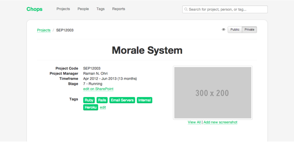
The app tracks company projects (who worked on them, what technologies were used, etc). A new feature was added recently to allow for project screenshots to be uploaded and displayed, but it could use some UI/UX love.
The structure & layout are indented for being used inside Words app. These examples are for testing & experimenting, but can be interesting to anyone who wants to see how newspaper layouts in HTML/CSS can look like. They are best viewed in Webkit (due to being used inside a mac app).

To write this post, I enlisted the input of some good friends in my industry, and of course, my team of over 20 SEOs at SEOgadget who work with these tools all day, every day.

These fuzzy felt artworks prove that you don't always need a computer to create something striking.

Introduce some automated CSS testing into your workflow for more time making and less time checking. Simon Madine explains how to get started

The website looks gorgeous on computers with super–high-resolution displays because it includes a high-resolution version of the main image. Delivering that image file doesn’t come cheap, though; its 1940 × 1229 pixels make the image 446 KB in size after compression.


Whether you use Microsoft PowerPoint or Apple Keynote to deliver presentations, there is plenty you can learn from the Apple presentation that kicked off this week’s Worldwide Developers Conference 2012 (WWDC). Several executives took to the stage to unveil new MacBooks, the new version of the OS X operating system (Mountain Lion), and iOS 6 for mobile devices. Each of the featured Apple speakers are skilled presenters, but the first 30 minutes of the keynote offers an MBA class in presentation skills. Here are eight techniques you can adopt to improve your very next presentation
His solution? Buy advertisements to appear whenever one of the executives searched for his or her own name on Google. The ads, which cost Brownstein $6, prompted them to hire him and check out his online portfolio. It was a bold bet on the vanity of the human spirit, and it paid off. Brownstein relates his experience in the video
The Producer's Mixtape is a kit containing CP+B’s interactive production checklist and a custom 3D printable case. And, we’re giving it away for free under a Creative Commons 3.0 License. Use it, edit it, put your logo on it. Help make the Internet a better place.
http://www.creativebloq.com/app-design/how-build-app-tutorials-12121473

Whether you're building an iPhone, iPad, Android, Windows, Facebook or cross-platform app, this superb selection of tutorials will help you on your way...
Design School for Developers is a tutorial series aimed at helping developers (and those new, or simply interested in designing for the web) to understand more about the techniques and decisions employed behind the design they may code.

Minimal designs and clever use of white space used to highlight the dangers of texting while driving in new ad campaign for Fiat.
Muse is one of Adobe's Creative Cloud applications aimed at building for the web. It specifically caters for designers with a print background, or those who simply don't have experience in coding. Muse's visual interface and tools allow users to design and deploy simple, static websites - so I'm going to show you exactly how that works.

Mureta created an app that not only enabled the Emoji keyboard, but also contained an additional 450 emoticons within the app itself, which could be shared via SMS, email, Facebook and so on.

UPDATED: Expand your vector knowledge with these Adobe Illustrator tutorials, covering everything from retro graphics to logo design.