The Rdio design team uses album artwork as its primary ingredient in this minimal and elegant redesign.
Viewing entries in
Web Design
A/B testing is the process of experimenting with different options in order to measure the relative success of each one. Where the web is concerned, A/B testing can make it clear which design choices are most effective; clear to the designer and (more importantly) clear to the client.
The very best ways to learn HTML, CSS, JavaScript, and the art of building websites, including free and paid tutorials, courses, instructor-guided courses, and reference material. Fifty resources, selected from a list of over 140.
Welcome to Webdesigntuts+, an online resource dedicated to teaching and encouraging web designers of all skill levels and experience. Whether this is your first time here, you've found yourself dipping into our content in the past, or you're a regular visitor, this post will help you find the best of our content.
Until recently, creating mobile web designs that look and feel like native apps has pretty much been an impossible dream. There are plenty of creative workarounds to try and bring that native ‘feel’ to mobile web browsing, but so far we've struggled to bridge the gap between native and the web.
There's a plethora of ways to tackle web dev and code, and professional designers and developers are no different. We asked several developers from various online publications what their favorite sources are for design and code inspiration, and the results are as varied as the projects these professionals make themselves.

We hand-pick some amazing examples of HTML5 in action, and talk to the designers behind them to find out how they were made.

Users are highly goal-driven on the Web. They visit sites because there's something they want to accomplish — maybe even buy your product. The ultimate failure of a website is to fail to provide the information users are looking for.

The crop of new development tools this month is rich and varied. Taking in web-based IDEs, testing tools, programming paradigms and more, there's enough raw material here to entertain a keen mind for months. If you wanted to be selective you could just study and apply new approaches like lazy loading, or reactive programming. Or maybe you'd prefer to tighten cross-platform consistency with GhostLab. And, if you're feeling particularly clever, you could explore the possibilities of deploying a Bunny 'darknet' from your coffee shop armchair.

There's plenty of free advice and tuition out there for web designers. Get your teeth into these great free resources.

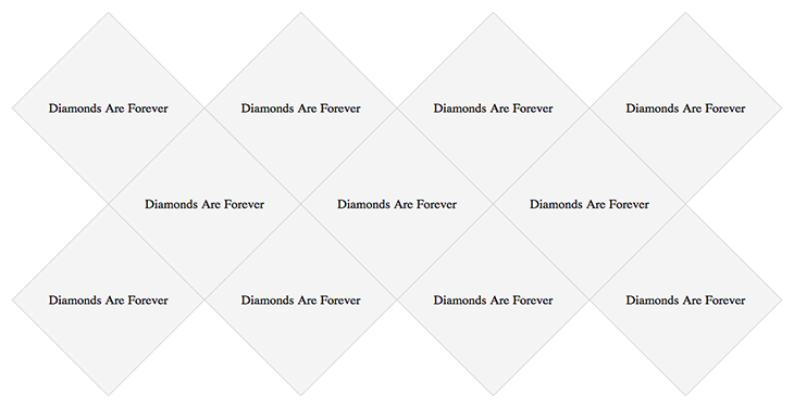
With the continued adoption of advanced CSS by browsers, we are starting to have the ability to do more and more using just CSS. As we have seen, you can make all kinds of crazy shapes with only CSS. On a recent client project, the designer challenged me with a grid of diamonds.
The biggest pain of retina becoming the standard for computer displays is the extra work that's involved in making it work on the web. But it's possible to automate your retina (@2x) for web workflow thanks to Slicy, CSS preprocessors like Sass or Less and retina.js.

Usability testing. Some people love it, some hate it, many don’t get it. Personally, I think they are the best thing anyone can do to learn from their users. In the same time, they are emotionally exhausting for moderators.

There are rules when it comes to creating, sharing and handing over Photoshop files. Follow them and colleagues will love you. Disobey them and invite their wrath! Designers, freelancers, lend me your ears. Whether you work as the former or the latter, at some point in your career you will have a job where end goal is to to pass your Photoshop files onto someone else.

It’s time to stop thinking about the Internet and online communication in the context of a device, be it desktop, tablet or mobile. Advances by Google and Apple have heightened consumer expectations, which now require stricter focus from us to create seamless online communications — communications that work everywhere and that get their point across. We need to embrace a device-agnostic approach to communicating with connected consumers and forget the idea of a “mobile Internet”. There is only One Web to experience.

We reveal the biggest mistakes to avoid, in order to guide your design to logo glory.