
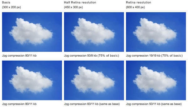
Basically an image can have larger dimensions, but can also be compressed more and you still get great results on a high-res screen.
Viewing entries tagged
Retina Display
Basically an image can have larger dimensions, but can also be compressed more and you still get great results on a high-res screen.
The biggest pain of retina becoming the standard for computer displays is the extra work that's involved in making it work on the web. But it's possible to automate your retina (@2x) for web workflow thanks to Slicy, CSS preprocessors like Sass or Less and retina.js.

One line of JavaScript and a few mod_rewrite rules and we have no fuss Automatic Conditional Retina Images. No DOM crawling. No redundant requests. No server-side scripts. No cookies? No problem, they just get the original image. The only change you might need to make to your workflow is explicitly defining image width and height in HTML (you should really be doing this already) and background-size in your CSS. And of course, creating retina images. If your original image is named circle.png the retina version should be circle@2x.png If you forget a retina image the original image will be served, even on retina devices.
CSS Sprites have been around for a while now. Matter of fact, they have been around for over eight years. They allow for some great monetary and bandwidth optimizations for medium and large websites, and they allow for a better experience on the user’s side, since there is a reduction in load time.
Looking to optimize your website for Retina Display, there you have it!