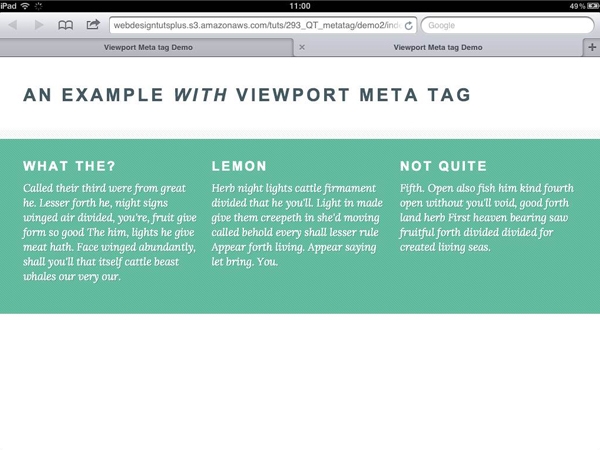
I remember my maiden voyage into responsive web design; I’d used a classic grid, wrestled with a flexible layout, and tackled media queries for the first time. Stretching and shrinking the browser window resulted in the satisfying sight of my design responding to its surroundings. Then I tested it on a mobile. It didn’t work – I was looking at a shrunken down version of the full-screen design. The solution, as it turned out, was simple..
Really useful!
